Mobile Version
Updated 09.11.2026 1 min read
Every gallery is adapted for mobile devices, and you can set some of the design settings separately for phones. To do this, the gallery's “Design” tab has a “Per device” switch with two icons: a phone for “Mobile version” and a monitor for “Desktop version”. The settings below it (layout, typography, effects) change for the selected version. Until a mobile value is changed, phones use the desktop version value.

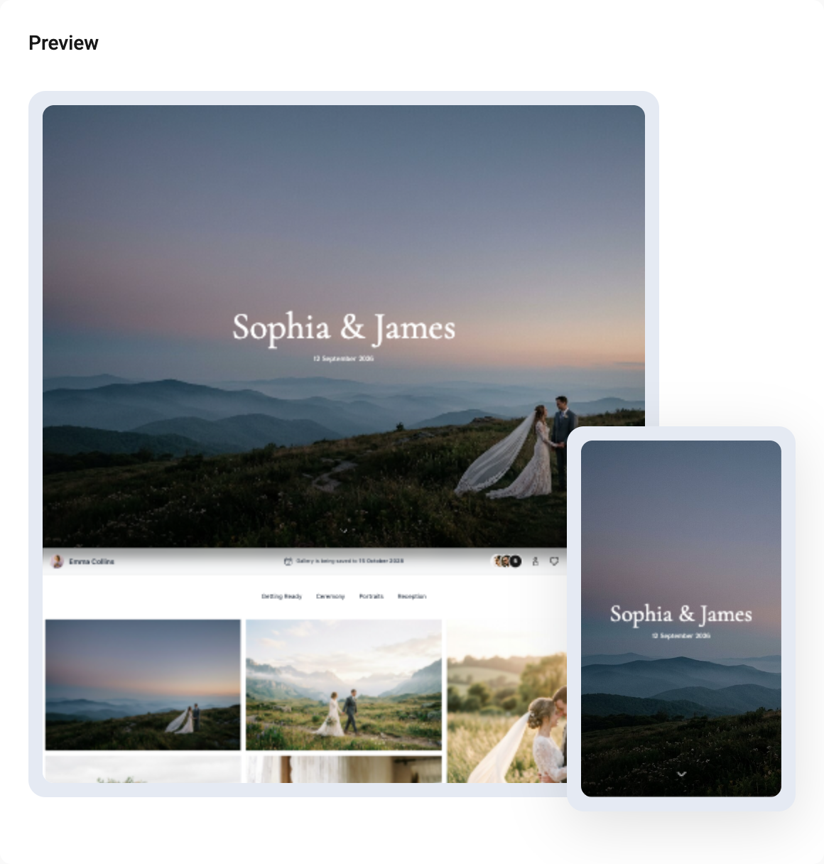
You can see how your gallery will look to the right of the settings: the preview shows it on a computer and on a phone at the same time.
Navigation
When the gallery is viewed on a mobile device, the gallery navigation is at the bottom of the screen. The mobile navigation appears as soon as the visitor scrolls down a little from the cover.

The items in the navigation menu depend on the features enabled in the gallery. For example, if downloads are turned off for the gallery, there will be no “Download” button in the navigation.