Site theme — colors, fonts, width
Updated 09.11.2026 4 min read
The theme sets the overall look of your site: colors, fonts, page width and corner radius. Blocks use these values by default, so it's convenient to change them in one place — and they change on every page.
How to open the theme
In the editor's top bar, click the palette icon — the “Site theme” panel opens on the right.
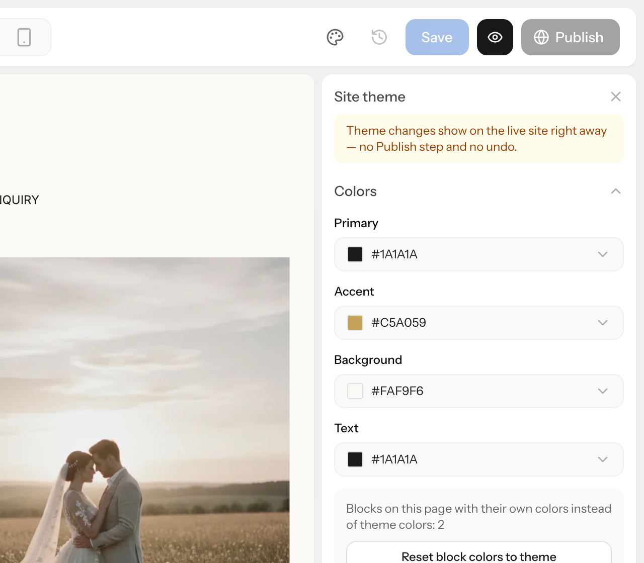
Theme changes are saved automatically and appear on the published site right away — without the “Publish” button. You can't undo them with “Undo” or ⌘Z: to go back, change the value back.
Colors
The theme has four colors: “Primary”, “Accent”, “Background” and “Text”. Three of them are the most visible on the site:
- Accent — buttons, quote marks in testimonials, marks in the availability calendar and in pricing;
- Background — the page background;
- Text — the text color.
You can pick a color in the palette, with the eyedropper, or enter a hex code such as #C5A059.
You can change a color separately in block settings. If you pick one of the “Theme colors” in a block's palette, the block's color will change together with the theme. The “Reset (theme color)” button gives the block the theme color back.
If the open page has blocks with their own colors that don't follow the theme, the “Reset block colors to theme” button appears in the “Colors” section. It gives all such blocks on the page the theme colors back. Unlike the theme itself, this is a regular page edit: you can undo it, and it reaches the site after “Publish”.
Fonts
Fonts are set separately for headings (“Headings”) and for text (“Body text”). Click the font field — a window opens with 39 Google fonts (serif, sans serif and handwritten) and the system font. At the top of the window there's a search and a sample text field: type your own text there to see how it looks in different fonts.
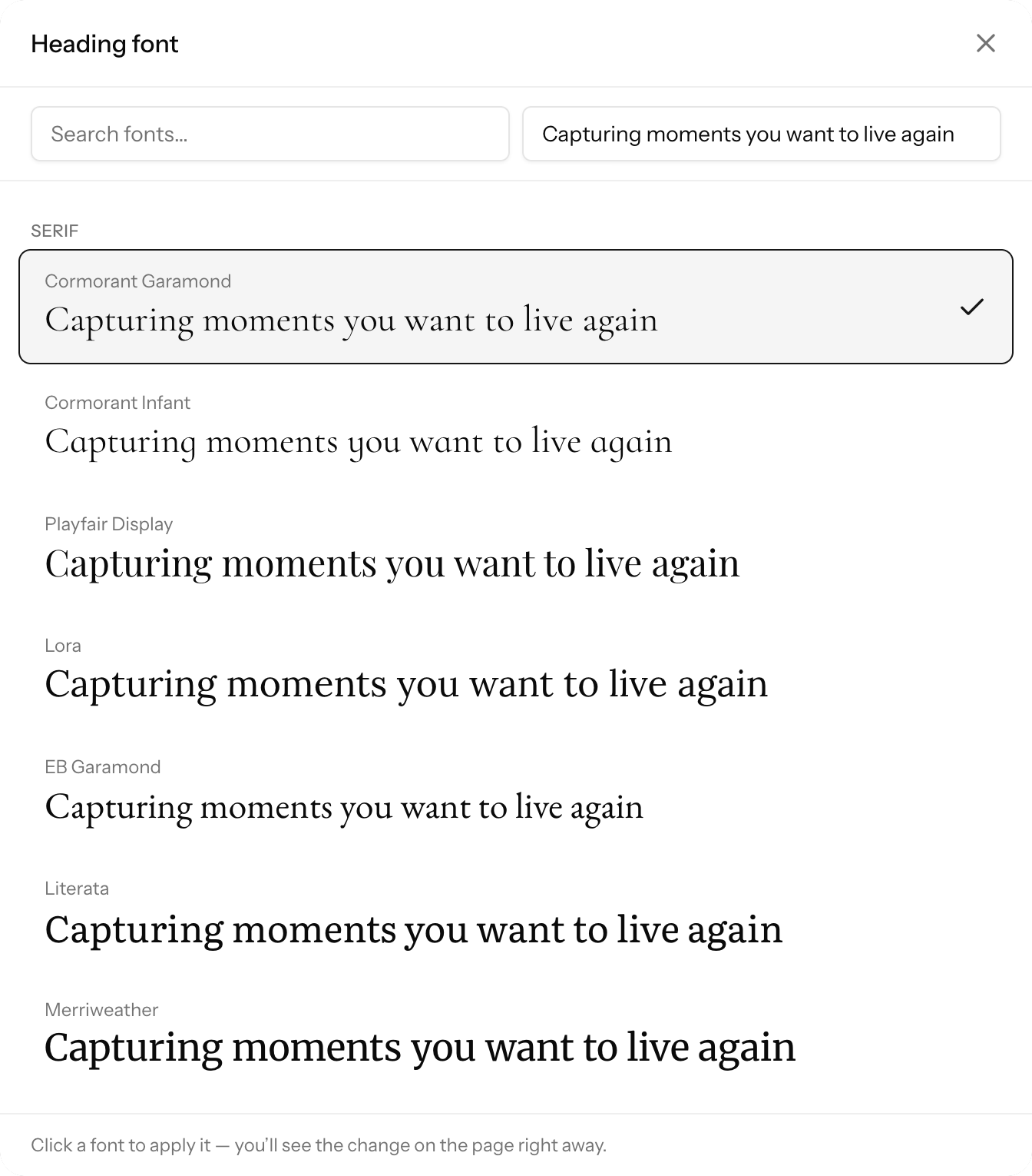
Clicking a font applies it right away — both in the editor and on the site.
- Headings in all blocks use the theme's heading font.
- For text in a particular block, you can choose another font in that block's settings.
If your site is in Ukrainian or another language with special characters, check that the font supports them: type a few words in that language in the sample field.
Custom font. In the “Custom fonts” section, click “Upload font”. Use woff2, woff, ttf or otf files up to 2 MB. Upload only fonts you have a license for. An uploaded font appears in the “Custom” group of the font list. If you delete a font that the theme uses, the editor warns you: the site will show a system font instead.
Page width
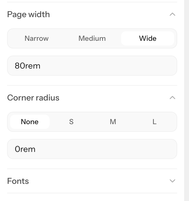
“Page width” is the maximum width of block content on large screens:
- “Narrow” — 1024 px;
- “Medium” — 1152 px;
- “Wide” — 1280 px;
- or your own value, such as
1200px.
The field under the buttons shows the width in rem: 80rem is 1280 px.
Block backgrounds can still span the full width of the screen. A block's content width is set separately in its settings, and the “Site width” option takes the width from the theme.
Corner radius
“Corner radius”: “None”, S (4 px), M (8 px), L (16 px) or your own value, such as 6px. The theme sets the corner radius of buttons and cards in blocks where it hasn't been changed separately.
Theme and template
Each template has its own theme. You change the template in your account: site settings → “Appearance”. Before the change, the “Change template?” window shows what will change: block, header and footer styles switch to the new template's. Pages, texts, photos and your own block settings stay.
The colors and fonts from “Site theme” stay too, unless you tick “Also replace my colors and fonts with the template's”. If you haven't changed the current template's colors and fonts, the box is already ticked — untick it to keep them.
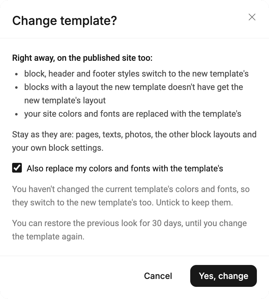
The new template applies to the published site right away. For 30 days you can bring the previous look back with the “Restore previous look” button in the “Appearance” section — until you change the template again.