The mobile version of your site
Updated 09.11.2026 3 min read
Your site adapts to phones by itself: columns stack one under another, the menu collapses into a button with three lines, and photos get smaller. You don't need to build a separate mobile version, but a few things are worth checking and adjusting.
How to view a page on a phone
In the editor's top bar, click the phone icon — the page narrows to the width of a smartphone screen. To go back, click the computer icon.
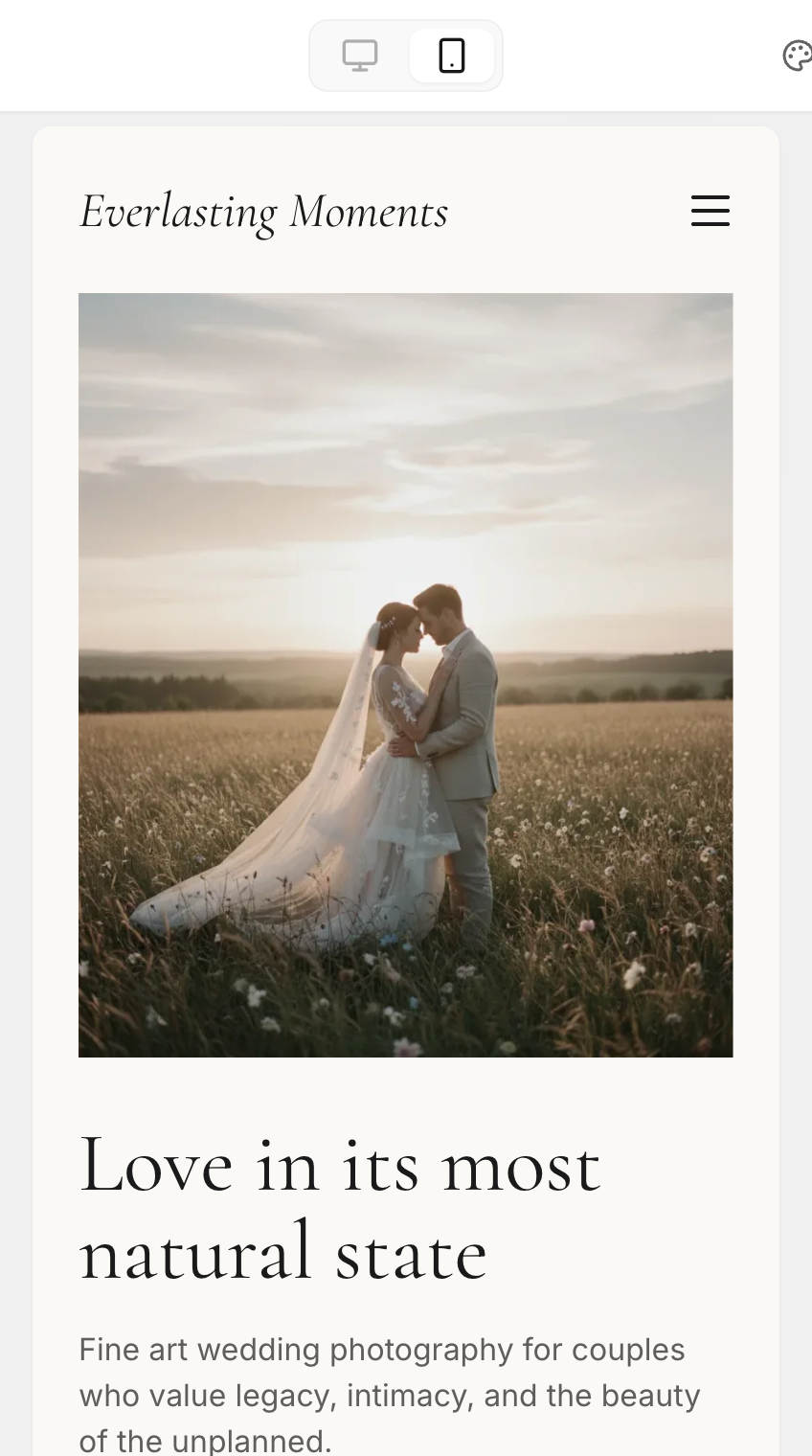
Be sure to check the published site on a real phone too: open the link or scan the QR code from the “Share” window in the site settings.
What you can change for phones only
In phone mode, some block settings change for the mobile version only:
- font size;
- alignment;
- spacing — inside the block and between blocks;
- exact photo width;
- logo size in the menu;
- space height in the “Divider” block;
- space between menu items or cards.
The settings panel reminds you of this at the top: “Settings changed here apply to mobile only.” A field changed for phones gets a phone icon next to its name, and a circular arrow appears on the right — “Reset to desktop value”.
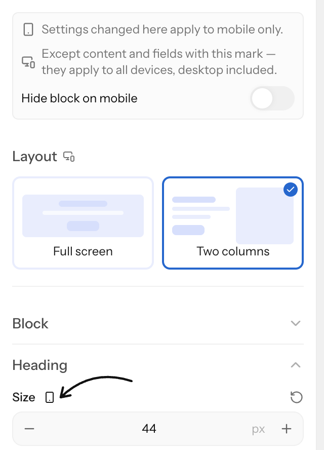
Colors, fonts, corner radius, shadows, the block layout and everything on the “Content” tab are shared by computers and phones. In phone mode, shared fields on the “Settings” tab are marked with a computer-and-phone icon — “Applies to all devices — the desktop version changes too”.
Mobile settings apply to screens up to 480 pixels wide, that is, to phones. Tablets show the desktop version, but columns still rearrange on narrow screens.
How to hide a block on phones
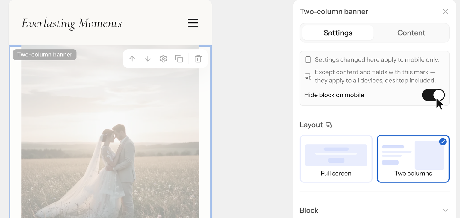
If a block isn't needed on a small screen, switch to phone mode, click the block and turn on “Hide block on mobile” at the top of the “Settings” panel. In the editor the block becomes semi-transparent, and visitors on phones won't see it.
Google evaluates your site by its mobile version. Don't hide important text on phones — for search it will be as if it isn't there.
Order of photo and text
In blocks where a photo sits next to text (the two-column banner, “Image + text”), the photo and the text stack on phones. Choose which one goes on top in the block settings: “Order on mobile”.
What to check on a phone
- Headings are easy to read. Large headings shrink on phones by themselves to fit the screen width, and a word that doesn't fit on a line wraps in the middle. If an important word breaks like that, reduce the heading size for phones.
- The main subject of the banner photo is visible. If faces get cropped, drag the focus point on the photo in the banner's “Content” tab.
- Buttons and menu items are easy to tap with a finger.
- The contact form works: send a test message from your phone.