Banner
Updated 09.11.2026 7 min read
A banner is the first screen of a page: a large photo, a heading, a short text and a button. Visitors see it before anything else, so this is where they decide whether to keep scrolling.
There are two kinds of banner:
- “Full-screen banner” — the photo spans the whole page width, with the text and button on top of it. It's usually placed on the home page.
- “Two-column banner” — the text in one column, the photo in the other. A calmer option that suits an “About me” page well.
How to add a banner
Most templates already have a banner as the first block of the home page. To add one to another page:
- Open the page in the editor.
- Hover over the block next to which the banner should go, and click “+” on its top or bottom edge.
- In the “Add block” window, in the “Banner” group, choose “Full screen” or “Two columns”.
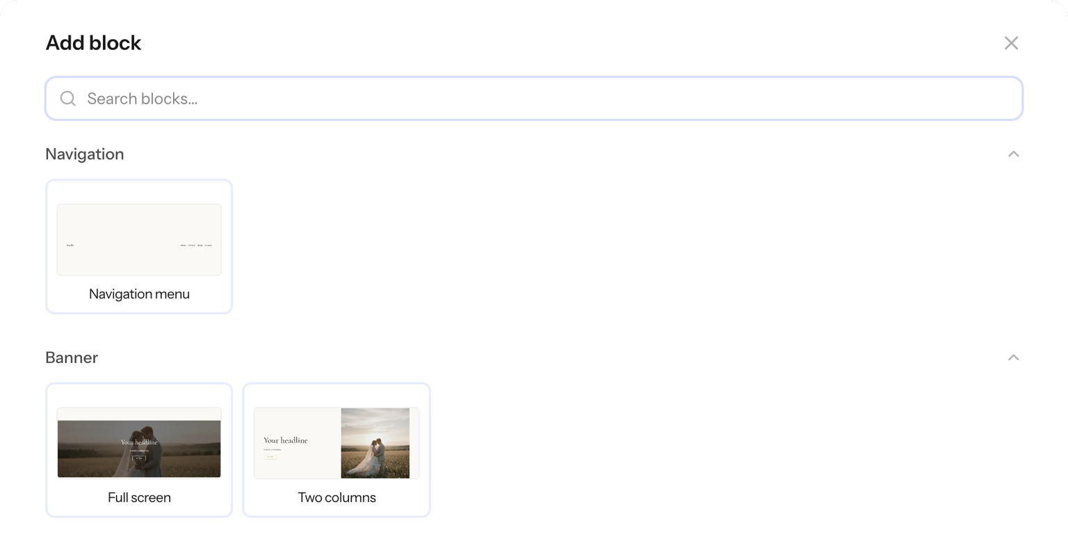
Use one banner per page, as the first block after the menu. The banner heading is the main heading of the page (H1): Google and other search engines take it into account.
What to fill in
The heading and the text below it are edited right on the page: click them and type.
Set the rest in the panel on the right: click the banner and open the “Content” tab.
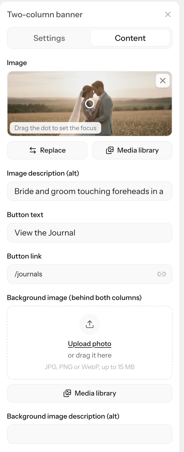
- Photo. In a full-screen banner the field is called “Background image”, in a two-column banner — “Image”. “Replace” uploads a new photo, and “Media library” opens the photos you've already uploaded and the photos from your Gallera galleries.
- Focus point. There's a white dot on the photo preview — drag it onto the most important part of the frame, such as the couple's faces. The banner crops the photo to fit the screen, and the dot always stays in the frame. The crosshair button, “Center”, moves the dot back to the center. Learn more in Cropping, aspect ratio and focus point.
- “Image description (alt)” — what's in the photo, in one sentence. Search engines and screen readers for blind people read it. How to write it — see Photos and search.
- “Button text” and “Button link” — the label on the button and where it leads: a page of your site, a section of a page or another website. To remove the button, clear its text.
A two-column banner also has “Background image (behind both columns)” with its own description, “Background image description (alt)”. This photo spans the full width of the block, behind the text and the main photo. It's optional: without it, the banner background is a single color.
Display options
Open the “Settings” tab. At the top, in the “Layout” section, you can switch the banner between “Full screen” and “Two columns”. The photos, texts and button stay as they are.
Below are sections for the parts of the banner: “Block”, “Heading”, “Subheading”, “Button”, and in a two-column banner also “Image”. If you click the heading or the button on the page, the panel opens its section right away.
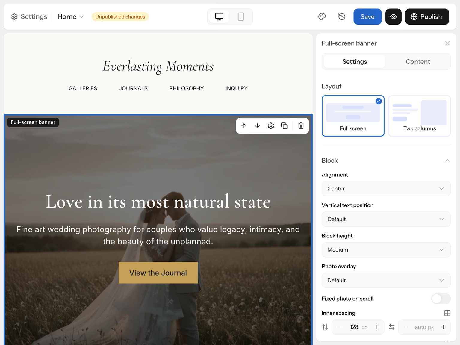
Full-screen banner
In the “Block” section:
- “Block height”:
- “Auto” — as tall as the text and spacing;
- “Compact” — about half of the screen;
- “Medium” — about 70% of the screen, this is how the banner starts out;
- “Full screen” — the whole screen below the menu.
- “Alignment” — text on the left, in the center or on the right.
- “Vertical text position” — text in the center, at the top or at the bottom of the banner.
- “Photo overlay” — “None”, “Light”, “Medium” or “Strong”. An overlay keeps the text readable on a light or busy photo. Until you pick a “Text color”, the text on the photo is white and the overlay is “Medium”.
- “Fixed photo on scroll” — the photo stays in place while the page slides over it. The effect is off in the editor, so check it in “Preview” or on the live site.
Two-column banner
In the “Block” section:
- “Photo side” — the photo to the right or to the left of the text.
- “Column proportions” — “Equal (1:1)”, “Wider photo (3:2)” or “Wider text (2:3)”.
- “Column gap” — in pixels, 32 to start with.
- “Block height” — “Auto” to start with: the photo is shown whole, in its own proportions, and sets the banner height itself. If you choose another height, on a computer the photo fills its column and is cropped around the focus point.
- “Order on mobile” — what comes first on a phone, see below.
- “Photo overlay” — applies only to the background photo behind both columns.
The “Image” section has the photo's “Width” in its column and “Corner radius”.
The “Heading”, “Subheading” and “Button” sections set the size, font, color and style of those parts.
Menu over the photo
To lay the menu right on top of the banner photo, like on a magazine cover, click the menu and turn on “Transparent navigation” in the “Block” section of the “Settings” tab. It works when the banner is the first block of the page. Learn more in Menu and footer.
On phones
- A full-screen banner shows the same photo, but a phone screen is narrow and tall. Only a vertical strip of a landscape photo remains — from a third to half of its width. The focus point decides which part stays visible.
- A two-column banner becomes a single column. Choose what comes first in “Order on mobile”: “Text first” — the default — or “Image first”. On a phone the photo is shown whole, without cropping.
- A large heading shrinks by itself: 60 px on a computer becomes about 36 px on a phone. If needed, you can set the size, alignment and spacing for phones separately — see The mobile version of your site.
Check the banner in “Phone” mode in the editor's top bar, and after publishing — on a real phone.
Limitations
- There's no manual cropping, only the focus point. To show a different part of the frame, crop the photo before uploading.
- You can't set a separate photo for phones.
- You can't put a video in a banner. For video there's the “Video” block, and in the “Image” and “Image + text” blocks you can replace the photo with a video: in the “Content” tab, choose “Video” in the “Show” field.
- The fixed photo on scroll is available only in the full-screen banner.
Tips for photographers
- The photo. A landscape frame, 2560 px on the long edge, with the subject close to the center and some “air” around it: on phones the edges get cropped. How to prepare photos — see How to prepare photos for your site.
- Put the focus point on faces, not on the dress or the landscape: faces are what must stay in the frame on a phone.
- A calm area for the text. A heading reads well over sky, grass or a wall and gets lost over small details. If the background is busy, add a “Photo overlay”.
- The heading is about your service and city. It's the main heading of the page, and Google sees it:
- good: “Wedding photographer in Lviv”, “Family photo sessions in Kyiv — Olena Koval”;
- bad: “Welcome”, “My portfolio”.
- A button with a specific action: “Check my availability”, “See weddings” instead of “Learn more”. Point it to the contact form or your portfolio.
If something's wrong
The photo doesn't stay in place on scroll. This effect is off in the editor. Open “Preview” — and make sure it's a full-screen banner.
Faces are cropped on phones. Drag the focus point onto the faces in the “Content” tab and check the result in “Phone” mode.
The text is hard to read over the photo. Turn on “Photo overlay” or choose a different “Text color” in the “Block” section.
The button isn't on the site. The button is hidden when the “Button text” field is empty.